Dealing with social media and networking is a chore. There’s so much going on in too many different places, and keeping track of all that information is hard enough; managing your own is another story. EventBox, a beta application for Mac OS X Leopard, is designed with this problem in mind. The purpose of EventBox is to aggregate the various social networks you utilize in one handy desktop application, much like feed readers did for all the sites you frequent. EventBox currently supports Twitter, Facebook, Flickr, Reddit, and also possesses RSS aggregation features. EventBox did support Pownce and Digg, but Pownce is shutting down, and Digg have done something to interfere with the way the application uses the API and thus Digg support is temporarily unavailable. So EventBox has a pretty short list of supported websites at this time because of these issues, but it’s important to remember that the app is in beta and growing every day. When it hits the big 1.0, it will support plenty of popular networks, and if it doesn’t, we’ll have a right to ask why the most popular services aren’t there. When software is in early beta, it’s a bit presumptuous and ignorant to complain that there isn’t support for enough services or the app is “complete rubbish” because it doesn’t have Feature X. Support for Google Reader, Delicious, Last.fm and Orkut are apparently coming in the future. If this means you can pull your feeds from Google Reader and read them from the application I’ll be very pleased. Last.fm is also a cool service I’ve been using for years and I’m looking forward to seeing what happens in this department.
User Interface
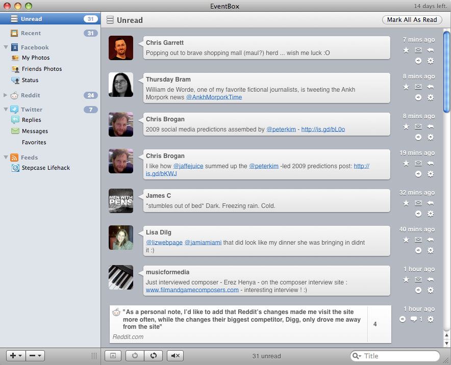
The user interface is slick and fits in right at home in OS X. It reminds me of Things, the task management application for OS X, which has also been admired by many for its attractive interface. Intuitive, easy on the eyes, everything in its right place and features accessible without looking cluttered — what more could you want? Well, there is something I could want — it’s minor but I’d love to see it changed. If you’re running the trial, to the right of the window’s title bar, there’s a little notice that tells you how many days you have left until you’ve got to part with cash. This is great because I always forget about trial expirations and get stuck with an app I’ve been using that won’t load up. But clicking on that text, even when the app is not the window in focus, will open your web browser and take you to the app website, and since the right corner of the window title bar is where most people click to drag the app or call it into focus, you can end up accidentally opening a browser with a saved session of 50 tabs every few minutes out of habit. It’s a small gripe in the midst of an excellent interface, but one I’d love to see fixed up (even if it’s fixed after I pay for the application).
Unread & Recent
The first two panes available in the sidebar are Unread and Recent. They do what it sounds like they’d do: Unread shows you information and events from the various networks that you haven’t seen yet, and Recent shows you everything both read and unread that happened recently — useful if you saw a Tweet or responded to a Facebook comment recently, and can’t seem to relocate them. These two panes do a good job at giving you an overview of what’s happening in each of your networks in one place. It also allows you to power through everything in one view, instead of going by and checking everything out service-by-service. This is much the same approach I take with feed reading; get them all in one list instead of reading feed-by-feed, and power through them faster than should be possible with the help of the good old space bar.
Social News Sites
Sites like Digg and Reddit are useful sites for many people, and can be a good way to fill in spare time (hah, like you’ve got spare time to fill!). And while the implementation in EventBox is good, and probably useful to many, I can’t see myself keeping up with these sites in the same application I would like to use to aggregate my social activity. The concepts don’t seem to mesh because there is nothing especially tailored to you about these services; sure, you can check out certain Reddit channels, but there’s still very broad strokes. When it comes to feed reading, you can be selective and subscribe to only the things that interest you. With social news sites, you get what you’re given. While these services will be useful to some and it probably would be impossible to deem the app complete without them, I like to think of EventBox as a way to catch up on much more relevant, targeted material — much of it personal — than what these sites provide.
Twitter & Facebook
Twitter and Facebook are the features of this app that really make it worthwhile and point to promising things for the future. They show how proper social aggregation should be done. The Facebook pane is a little light on features at the moment, but that will probably change as the application matures; last I checked you could only see people’s statuses and post your own, and view your friend’s pictures. Twitter is fairly well-rounded and allows you to do most anything you could do on the site. Twitter Search is right there built-in and that’s pretty useful. There’s a Profile Peek feature that allows you to keep an eye on any individual twitterer’s tweets, and tabs to monitor @replies directed to you and direct messages. TwitPic integration would be a great addition.
RSS
The RSS reader is well-implemented and uses the familiar two-pane view to navigate and read posts: on top you can see all the posts in your reader or an individual feed, and in the bottom pane you read the content of that feed. You can get to some basic functions by right clicking a post — email, open or copy the link, delete the entry from the view, and so on. For my tastes, it’s a little basic, as I like to make the most of a reader’s power features to get through the information faster. However, it will suit most people just fine and keeps everything in one place which is well worth the switch on its own.
Keeping Users in the Loop
The developers are responsive and listen to the needs of users. They’re active on Twitter and get involved in conversation. This is all great. But when it comes to finding information, there’s a bit more difficulty. There’s no blog or way of checking recent news. Using Twitter and openly communicating is excellent, but it’s not the best for news and information. When I wondered why the Digg support promised on the application’s website was missing from the application, I had to resort to Twitter Search because there’s not enough info on the site. A blog could’ve made this much easier. Twitter doesn’t allow one to convey information in any amount of detail and it’s hard to find any tweets that are older than a couple of days. There’s also no information on using the program. Even a brief, one-page walkthrough on actually using the software would be better than nothing, but you’re entirely left to your own devices and need to figure out which features are and are not there for yourself. I would’ve loved to see release notes, but I couldn’t find them online, or find a way to get to them from within the application. The lack of documentation is excusable; this is beta software and time spent writing documentation would be time wasted. But I have to say I think every app needs a blog or some way of conveying information on-site, and if any app needs it most, it’s an app in beta.
Final Thoughts
EventBox is a great application. Where it does support services, it supports them well. It’s essential to remember that this is beta software and should be evaluated as such. I’m going to keep using it even if only to aggregate a couple of services in one place, and I know it’s going to be even better with a few more services supported. That’s all it would take to make this app awesome: more supported services, a blog, and a bit of documentation. What’s there is great. We just need more of it! Looking forward to the 1.0 release.

